
Spectrum Quick Pay
Paying bills is not fun. Let's get them in and out quickly.
PROJECT DETAILS
Client
Spectrum
Team
Mobile Design Team
My Role
Product Design/Research
Duration
3 months
OVERVIEW
Quick Pay is a streamlined bill payment feature that simplifies the user experience. The new feature should enable users to complete bill payments more quickly and with fewer steps, while maintaining or enhancing the security and accuracy of transactions. The goal is to create a more intuitive and efficient flow that reduces friction, minimizes the time spent on payment tasks, and ultimately improves user satisfaction and retention.
Objective
The goal is to streamline the payment process, reducing friction and improving user satisfaction by enabling one-click payments using a primary credit card.
Persuading stakeholders that prioritizing convenience over customization is the optimal approach.
The Problem
Users frequently encounter challenges when paying bills through our platform, leading to delays, frustration, and inefficiencies. The current bill payment process involves multiple steps and requires users to navigate through several screens, resulting in a time-consuming experience. This complexity increases the likelihood of errors and reduces overall satisfaction with our service.
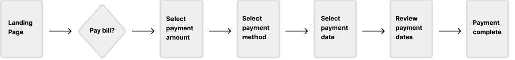
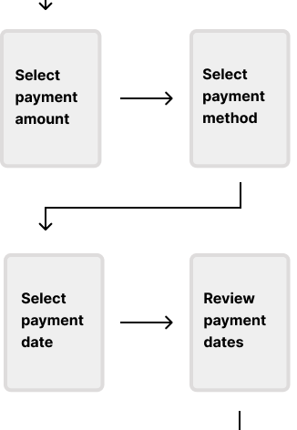
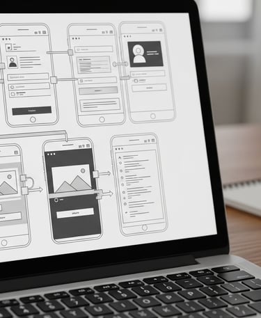
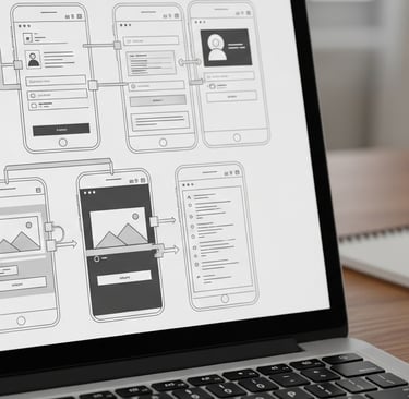
ORIGINAL FLOW
To give context, please reference the orignal flow.
KICK'N IT OFF
Conducted mobile usability tests on the bill payment experience, focusing on selecting a payment date and using a saved credit card. Evaluated navigation ease, clarity of payment options, and confirmation steps, while noting friction points like confusion around date selection, card choice, or transaction feedback.
User Interviews
Golden Nuggets
We interviewed 8 Spectrum customers that used our mobile app. The overall opinion was how long the process takes to make a simple payment.
Users comments:
“It takes forever just to pay my bill!”
“Why do I need to select my card every single time?”
From our analytics department, we discovered that an overwhelming about of customers paid their bill at the deadline and on their same card every month (even when they had 1 or more cards saved).
INSIGHTS
Paying bills is an unpleasant experience. Users valued speed and convenience over customizability in this process.
An intuitive design that allows for “one-click” payments was a frequently suggested improvement.


PROBLEM STATEMENT
We created a problem statement to clearly define the user's core need or challenge, ensuring the team stays focused on solving the right problem throughout the design process.
How might we simplify the phone bill payment process to reduce user frustration and drop-offs while maintaining a secure and seamless experience?
IDEATION PHASE
My ideation process involves whiteboarding to brainstorm ideas, wireframing to visualize solutions, presenting to stakeholders for feedback, and validating wireframes through user testing.
Step 1: Brainstorming
During brainstorming, we sketched ideas, mapped user flows, and organized concepts to refine user-centered solutions
Step 2: Prototyping
Created prototypes for stakeholder presentation and usability testing
Step 3: Validation
Showing prototypes to users and gathering feedback


VALIDATION FINDINGS
Through our testing we felt like customers preferences validated our insights:
Users valued speed and convenience over customizability in this process.
Because of the unpleasant experience of paying bills, testing subjects preferred a “one click” paying experience.


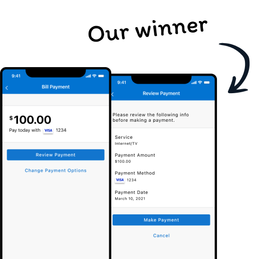
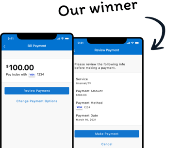
THE SOLUTION
We created two designs that we felt comfortable with going into user testing.
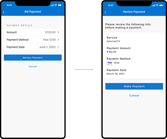
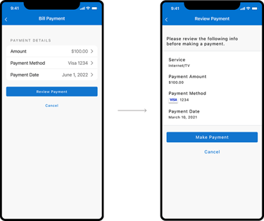
For both designs we default customer’s full payment and primary card on file. For editing, Design 1 took a hub and spoke approach. This tested well, but people felt the design more of a secondary page vs a first screen for payment. There wasn’t a clear hierachy and because of the chevrons people kept clicking to see editing screens. Comprehension was murky which gave us pause.
Design 1
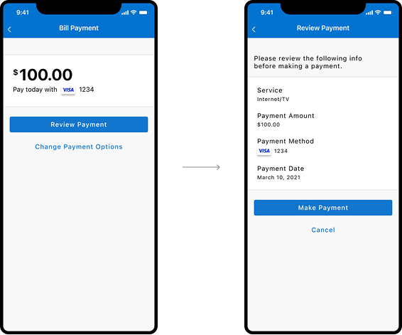
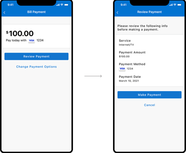
Design 2
Design 2 had more design thought behind it. People quickly saw their payment amount and card being charged. The flow was a step through and liked how clean the interface was. Customers also noticed the Change Payment Options to go through the “long flow” for editing their payment.
THE RESULTS
Employees appreciated the ease of use and the reduction in time spent managing shifts. Managers valued the automated notifications and reduced administrative load.
92%
Payment Completion Rate: Increased from 70% to 92%.
Time to Complete Payment: Reduced from an average of 3 minutes to 45 seconds.
Positive reviews increased at the Apple and Google app stores.
45
12%
seconds
LET'S GET IN THE WEEDS
If you want to get a detailed review of this project or any other project - please contact me. I would love to show you my in-depth use cases.


Grant Christman
Explore my UX design projects and case studies.
Contact
773.620.4981
© 2025. All rights reserved.
foot01@gmail.com