Introducing
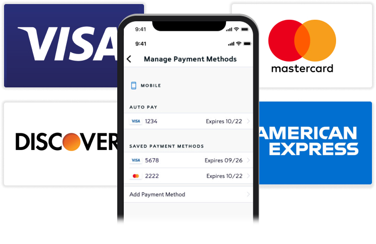
Spectrum Digital Wallet
Case Study: Flagging Auto Pay Card

Client
Spectrum Mobile

My Role
Design Lead
Overview
Proving a new flow
with data
The Project
Not all problems/issues come from customer’s mobile behavior. I was leading the design for our new digital wallet integration, Spectrum Mobile’s first digital wallet, and our third party vendor had technical rules that were not following good UX practices.
The Problem
Our third party vendor vendor had rules in place for our customers to flag another card as their Auto Pay card. Below is a diagram of the rules.
Customer clicks on Auto Pay (primary card) and then turns off Auto Pay function.
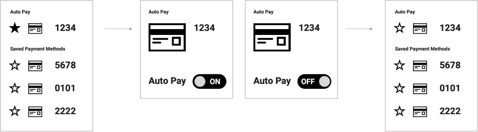
Customer then clicks a Saved Payment and then turns on Auto Pay function.
Issues with this flow
As you can see, this flow is a bit odd. My team thought had several questions and vendor’s answers.
What if a customer drops off before they turn on the saved payment method?
The orignal Auto Pay card turns back on.
What if the customer goes to the saved payment method first?
Can’t turn on Auto Pay before customer turns off the primary card.
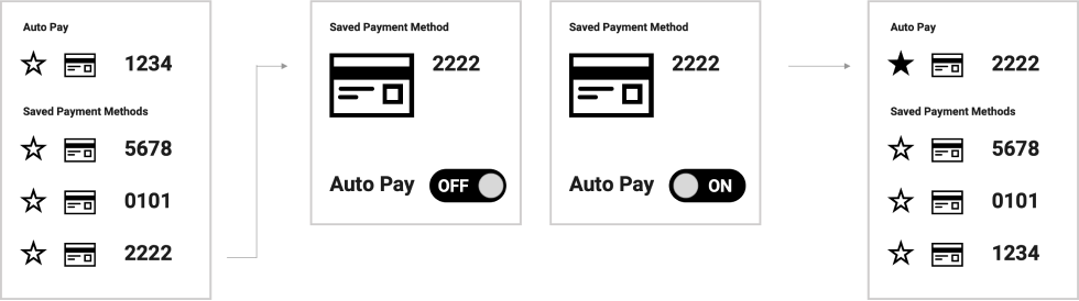
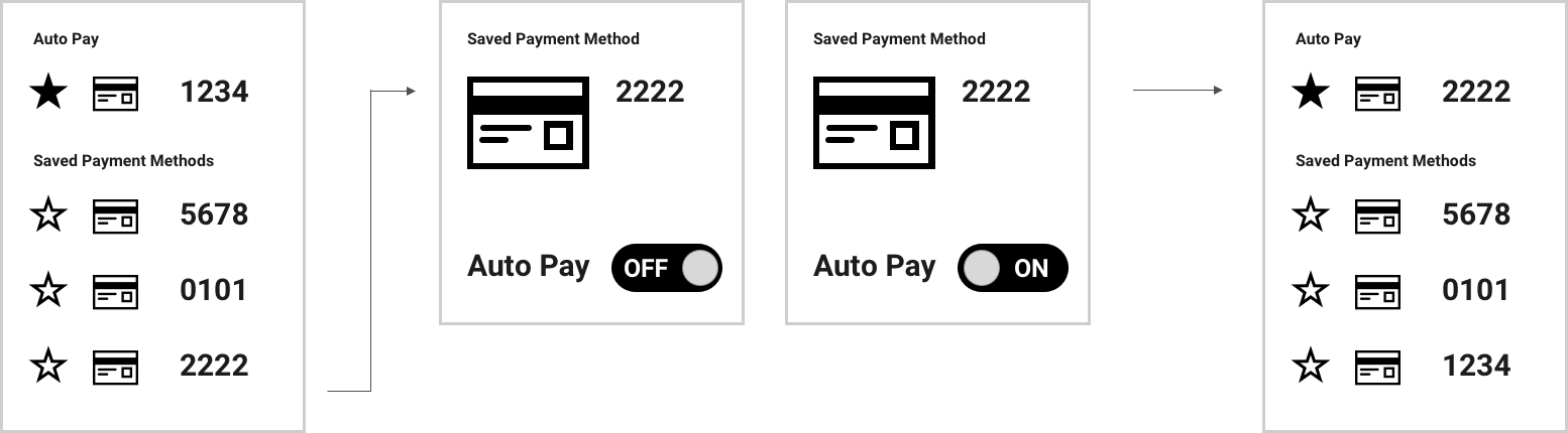
What We Proposed
We thought the current flow wouldn’t create the best experience for our customers. We created two usability tests (with prototypes) to validate our theory. We tested our vendor’s flow vs. our proposed new flow. Our flow cuts our serveral clicks and has the backend doing some of the heavy lifting.
Customer clicks on a Saved Payment Method and from there turns on Auto Pay. The backend unflags the current Auto Pay and saves it in Saved Payment Methods.
User Testing Results (Tech Flow vs. Our Flow)
Hey there, this is the default text for a new paragraph. Feel free to edit this paragraph by clicking on the yellow edit icon. After you are done just click on the yellow checkmark button on the top right. Have Fun!
Tech Flow
➤ 80% of the users went to the saved payment to flag as primary auto pay card.
➤ 20% of users couldn’t complete task without some guidance.
➤ Most users took along time to figure out to turn off primary card first then turn on saved card. 2.5 times longer (because of wayfinding).
New Proposed Flow
➤ 100% of users completed the task.
➤ 80% of the users went to the saved payment to flag as the primary auto-pay card.
➤ Average time to complete task was under 30 seconds.
Our Big Win!
With these new findings, we went back to our third-party vendor and got our vendor to implement our requested changes. Big win for my team!